Studying at the school of popular culture
A good pop culture reference can really make your ad one to remember. But what happens if your execution falls short?
I saw the MoMA exhibition at the NGV recently. If the stream of people taking selfies in front of Marilyn Monroe is anything to go by, Andy Warhol was onto something.

Warhol and his contemporaries embraced the popular culture of their time and threw it back at us. And people still love it.
By its nature, pop culture is continuously evolving. But the best bits from the past are still relevant, and they can certainly teach us a few things.
Give me something
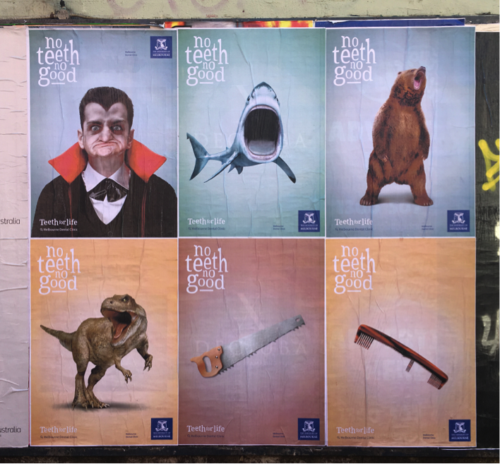
Posters have always been part of pop culture. Unfortunately, most of the stuff that gets slapped up is pretty forgettable. One recent campaign caught my eye… I call it the dentist campaign.

There are things to like here. They’re simple, uncluttered and fun. The repetition reminds me of Warhol’s Marilyn series. And importantly, they contain an idea.
But there are several problems, too. Purely from a visual perspective, the mouth of the bear is way too small to identify the lack of teeth, which kind of defeats the purpose of the image. The saw and the comb feel like a different idea: not the same meaning of ‘teeth’. The shark almost works, but…
Hit me hard and fast
Now, I’m not here to bag anybody. That’s not the point of this discussion. This is about learning from pop culture to create work that has impact and is appropriate for its media, in this case street posters.
Most people see street posters through the window of a moving car. That means everything on the page needs to work hard to tell the story quickly.
Consider the shark poster from the dentist campaign.

Here’s the thing. If you want to highlight a shark’s mouth, in particular its teeth (or indeed lack thereof), just look back into pop culture and you’ll see that someone has already done it, and much more powerfully than you or I ever will.
I am of course talking about this image, created by the American illustrator Roger Kastel.

The dentist campaign is all about teeth, so why isn’t the shark cropped to focus on its mouth, like in the Jaws poster? There’s no need to show the whole fish.
Dracula was given the crop treatment, although they could have gone in a little tighter. The images of the bear and the dinosaur would have been much, much more powerful if they, too, were treated this way.
On the subject of dinosaurs, here’s another iconic pop culture image – and possibly another lost opportunity for the dentist campaign. Very toothy…

Help me, I’m bored
Sadly, not everyone is as excited about advertising as the people who create it. Which is why text should be easy to read, especially on posters.
If I hadn’t crossed the road to take a closer look at the dentist campaign, I never would have known the identity of the advertiser. That’s bad.
Even the humble meme, to pick an example from contemporary pop culture, knows the importance of legibility to communicate a message quickly. In fact that’s precisely why memes are so popular: they’re snappy gags.

The dog ate my homework
As I said at the start, it’s not my intention to criticise the dentist campaign or those who created it. There are usually good reasons for everything.
Most likely, the images were created for another purpose – such as a website – and subsequently extended into a media for which they were never intended.
But we owe it to our clients, our industry and ourselves to stop making excuses. If you get it right, who knows? Someone might want a selfie in front of your poster one day.
Back to Posts