The elements of a brand: colour
Colour says more about your brand than words ever could. Get it right, and it becomes unforgettable.
In simple terms, let’s look at the elements that define a brand.
Of course, there’s the brand name, the logo, the all-important tone of voice, and supporting elements such as typography, photography and illustration. But at the forefront of many brands is the colour palette. Consider some of the leading international brands and how they’re defined by colour: Ford – blue, Cadbury – purple, Netflix – red.
At Sense, we’re fortunate to work with one of the most iconic and recognisable brands, Shell, a company synonymous with red and yellow. Now, let’s say Shell decided to rebrand and change its colours to green and blue. Imagine the cost, the confusion, the amount of brand equity flushed away. A recent high-profile example is Jaguar and their bold, but most likely misguided, decision to launch themselves into the future by abandoning British racing green in favour of hot pink and neon blue.

A good brand is defined by its colour choices. So how do we pick a colour for your brand, and what does it say about it?
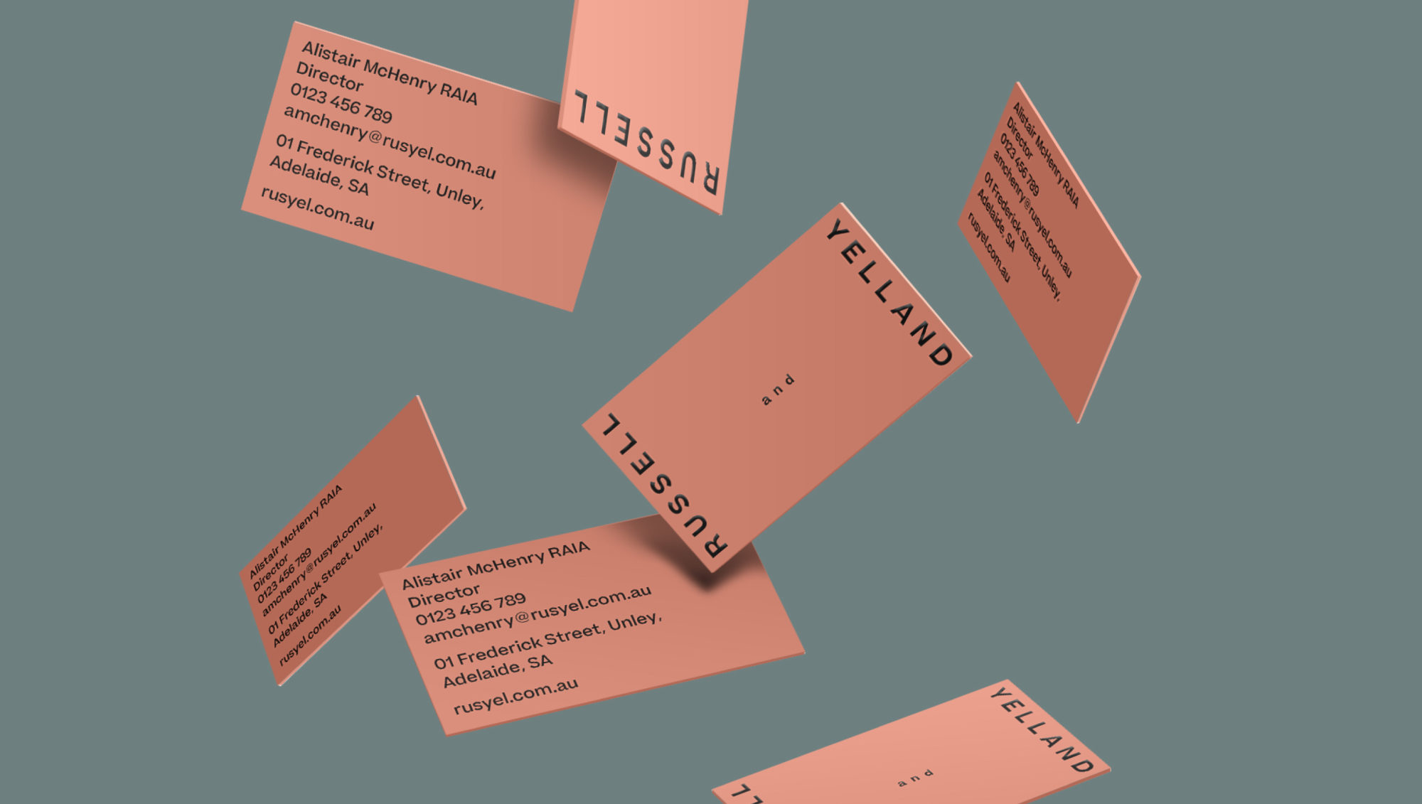
One of the main things we aim to achieve is an emotional connection between your audience and your brand, and what better way to do it than through colour? When it came to our rebrand for the established architecture firm Russell & Yelland, we took inspiration from natural materials that reflect their design ethos – a palette inspired by terracotta, concrete and timber. The result brought a sense of warmth, paired with the pragmatic restraint befitting the industry.
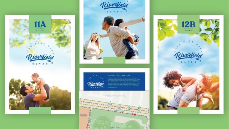
Or take Riverfield, a building development in Clyde, an area with numerous competing estates. In this case, we wanted to strike the right balance for the target audience, selecting a vibrant blue and green combination that’s both approachable and elegant, without tipping too far in either direction. And of course, in basic terms, the colours tie directly into the brand name – River (blue), Field (green). This in turn informed the art direction for brand photography, featuring mostly positive blue-sky imagery with natural green elements. Everything ties together.
Of course, colours come in and out of fashion. Millennial pink had its time, then the design world became awash with sage green – now orange is having a moment. Marketing departments get bored of their brand colours, but customers don’t. If you’re embarking on a rebrand, colour is usually the thing that should remain. That said, brands evolve, and sometimes a colour change makes sense.
Which brings us to a recent rebrand for the accountancy firm Wilson Pateras. What started as a relatively small firm was on an upward trajectory and needed a visual makeover to reflect that. Out went the flimsy and dated lime green palette in favour of a more mature and trustworthy navy and warm white, with a vibrant pop of yellow as a visual counterpoint – suited, but not buttoned up.

Colour says a lot about who you are as a brand – and getting it right is worth the effort. Whether you’re looking for a full rebrand or a subtle refresh, we can help your identity feel more connected, more confident and more you. Get in touch with Sense to start the conversation.
Back to Posts