The finishing touch
How finished art ties the bow on your brand creative, and why such attention to detail has become more crucial than ever for your business.
If ever you’ve known or had dealings with someone in the print or creative industries, you may have heard the term ‘finished art’. Maybe someone has even introduced himself or herself to you as a ‘Finished Artist’.
But what exactly does that term mean? What does a Finished Artist do? What kind of art are they talking about? Aren’t Graphic Designers or the Art Director the ‘artists’?
Let’s start with those guys – the Graphic Designers and Art Directors – and consider that all their work moves from a conceptual stage, into a production phase once its approved.
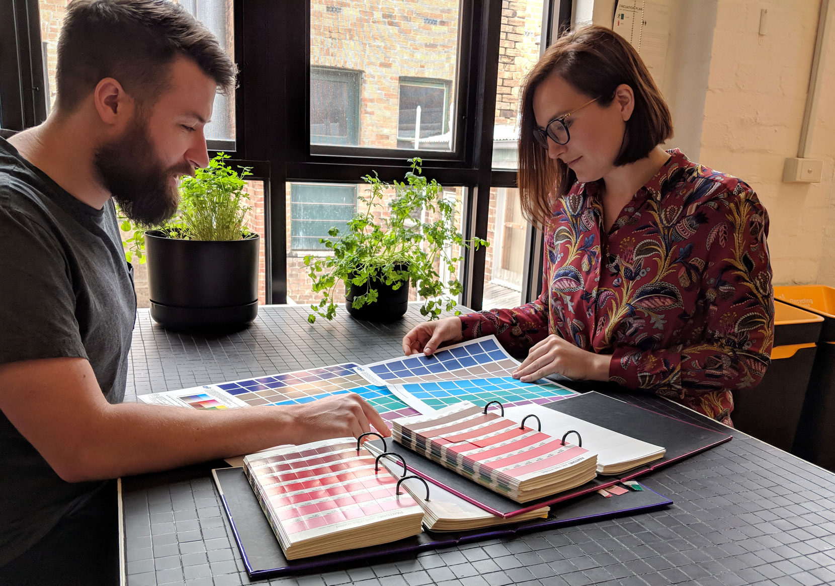
As creative ideas progress toward final execution, a Finished Artist’s role is to make sure that everything will look as intended across a variety of media. Think of it as a kind of Quality Control. We’re there to ensure everything remains ‘on brand’.
Even copy isn’t immune. If something sticks out to us as unclear, we’re there to ask if something actually means what you think it means.
Basically… what others start, we finish. It’s our responsibility to triple check everything is as it should be before the point of no return is crossed and possibly tens of thousands of dollars are spent on something not-quite-right.
In other words, we use the full capability set of programs like those offered in the Adobe Suite – particularly InDesign, Photoshop and Illustrator – to tie the bow on your brand’s creative and make sure it looks its best before sending it off into the world.

The material of creation
The foremost responsibility of a Finished Artist then is to preserve the essence of your brand, from the guidelines or initial creative all the way to the finished product, be it printed collateral, a website, social media graphics, online advertising banners, signage, vehicles etc.
Because each of those outputs has a different set of requirements for the type of material you expect to receive. And getting it right is crucial to ensuring the finished product is a faithful reproduction of your brand identity in terms of colour and style.
For print, this can be setting up cuts and folds, spot colours, ink weights, foils and varnishes, photo retouching, checking typefaces, etc. It’s hugely detailed, technical work – the ‘art’ is in how we make all that hard work invisible.

Screening the work
Online is same same, but different. And it will come as no surprise to hear that it’s in the digital space where Finished Art has been transformed the most, absorbing new responsibilities and outputs, requiring new workflows.
In many ways its much more simple – there’s really only one colour mode (sRGB) – but things still need to be set to the exact dimensions, and image quality needs to be balanced with file size to get the most out of any photography you might be using.
But we’re seeing more and more digital assets required for social media also, where each channel has its own ever-changing specifications and restrictions – including a range of restrictions on word-counts and character-limits that need to be considered.
The importance of preserving brand integrity across these digital channels is vital – the small business that pays attention to these things will definitely stand out from the crowd. Consistency is powerful in this regard.

The prestige of print
With so much consumer activity moving online, it’s valid to ask the question: is there still a place for print? Absolutely, is our answer.
What used to be a mass communication medium now has an air of exclusivity. Developments in paper stock mean new ranges are of higher quality, and compatible with digital printing for smaller runs.
High-end print brings a textural element into play that pure digital will never have. And if your customer is holding something in their hand with your name or logo on it, they are in a very real sense closer to a purchase of your product.
That’s why, despite a downturn in overall printing in recent years, clients that embrace print solutions look to set themselves apart by opting for premium paper and stocks.
It’s not enough anymore to just have a gloss brochure on a mid-weight stock – textured papers, foils, varnishes and interesting custom die-cuts are very much in vogue.

That’s what a recent client, Riverhills elected for with their premium land offering in Melbourne’s competitive northern corridor. Stitched binding, gold-foil lettering and good, heavy stock for their brochure… the end result really does reflect their prestige point of difference.
Such material approaches present their own set of challenges at artwork time, but the end results are rewarding for everyone involved – and really work to impress your brand in someone’s mind.
Because ultimately that’s what a brand should do. It should leave a mark. And Finishing Art is the fire that finally, finely tempers the brand you’ve worked so hard to forge.
Seriously, I can talk about this all day. So if you’d like to know more about what it can do for your business, call us at Sense… and let’s start something worth finishing.
Back to Posts