Architecting a new brand identity
Refreshing a brand is sometimes a simple matter of taking a knife to what came before. A client with clarity of vision doesn’t hurt, either.
Design is a powerful way to communicate a brand’s values. At its best, it works seamlessly alongside other tools like copy and photography to express the intention, purpose and worldview of the client’s business.
It’s always a journey to find what the visual essence of a company is, and it’s always made easier when the client brief reveals a true self-awareness about their work and confidence in their own mission.
Easier still when they have a distinct point of difference in their field.

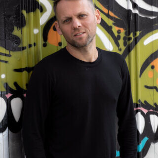
That was the case when Melbourne-based architect Steffen Welsch came to Sense with a desire to refresh the identity of his Bauhaus-inspired studio.
Steffen was very clear that he sought a raw sensibility in any new branding. Its aesthetic would have to reflect the same material efficiency informing his own approach to work.
Proposed designs would have to evoke the qualities of sustainability, and there was to be no flourishes or unnecessary embellishment, nothing that might dilute or override human interaction. Functional, essential, purified.
Ultimately, the client wanted a purposeful, even militant dimension to the identity. In this way any branding could communicate confidently and powerfully about ideas that his firm felt are worth sharing, debating and defending.
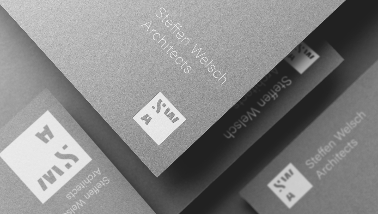
With that established, I felt a lettermark logo provided an excellent place to begin.
More with less
Given the client’s desire for a stripped back approach, I wanted to explore just how much we could remove from such a logo rather than what we could adorn it with.
So taking the name – Steffen Welsch Architects – the natural first step is to explore the acronym SWA.
So far, so obvious. But then what?
Letters have their own architectural form. Even if you see only a small slice of the Sydney Harbour Bridge or Opera House, your mind completes the entire form. Letters are the much the same, so I took each letter of that brand acronym to the very edge of legibility, to reveal their most essential structure.
The end result also proves flexible and adaptive, tying back to the client’s express desire to capture the fluid identity of the firm’s work with the ability to translate across media, able to stand apart for branding while perfectly compatible with a lockup for more formal collateral.

The Grid Iconic
Beyond that, I felt there was scope to convey the functional aspect of the brand in more subtle ways.
The square of the logo can be complemented by the visible grid in printed and digital environments, allowing SWA to play with structured formality… while breaking the rules where it makes sense to do so.
I also felt that grid made a great jumping off point for the unique logos, created to draw out the particular functions and applications of SWA designs. By always appearing in the square, they imply functions while iterating on the geometry that underpins the brand.

Trust in translation
The invitation to capture – or redefine – in lines and colour the energy and philosophy of a brand is always interesting. It’s a rewarding journey, more so when a client comes to you with confidence in their vision, and trust in your ability to translate it into another language.
In the end, the most effective brand identities really come down to:
Clarity / Utility / Consistency / Difference
With these foundations in place, the best alignment between vision and visual identity can emerge much easier to take on a life of its own in the world beyond your company walls.
Have you thought lately about how your brand is speaking to its audience? We can help make that conversation more interesting. See more of our work here, and say hello.